Student Connections is a non-profit focused on serving students pursuing higher education. As part of this mission, they built "WhichWay?" an app designed to teach undergraduate students the basics of personal finance, student loan management, and career development.
I was hired to act as a creative consultant to Student Connections' content team. They were responsible for the app's curriculum and lessons. During the year I worked on the project, my role shifted to meet changing creative needs of the project.
Key Contributions:
+ Introduced standards for using graphics and video within lessons
+ Created the initial visual layout of the lessons
+ Helped define a voice for lesson copy
+ Assisted in instructional design of lessons by editing lesson copy
+ Developed a strategy for incorporating student-focused video into lessons
+ Wrote scripts for video and animation
+ Co-ordinated and oversaw video shoots
+ Contributed to the design of lesson activities
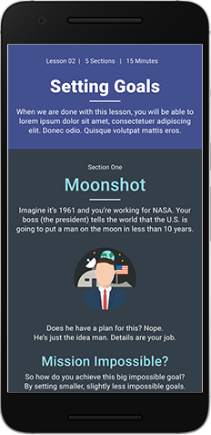
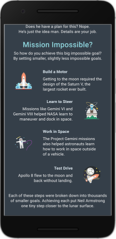
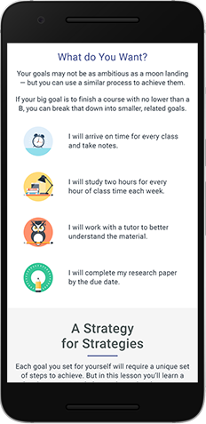
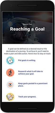

Final lesson design. Art direction by Harrison Thee.
Crafting a Learning Experience
I was recruited onto the project by the content team's lead. While the team already had a SME and two instructional designers, it lacked someone who combined a background in eLearning, visual communication, and writing.
After working closely with the content team and liaising with core members of the dev team, I identified a few key issues. My solutions were encapsulated in a lesson mock-up. These became the core concepts that would shape the creation of lesson content throughout product development of the product's platform. They included:
+ The addition of lesson introductions designed to provide a broader view of key topics
+ Use of metaphor in lesson copy and graphics to make abstract concepts concrete
+ Adoption of an informal writing voice that prioritized brevity and clarity
+ Breaking up large blocks of text by using icons for lists
+ Using stock photography to reflect the diversity of the product's audience
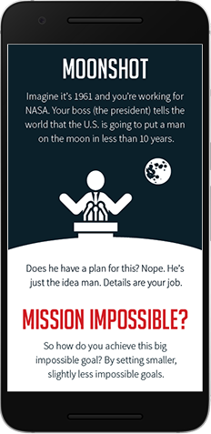
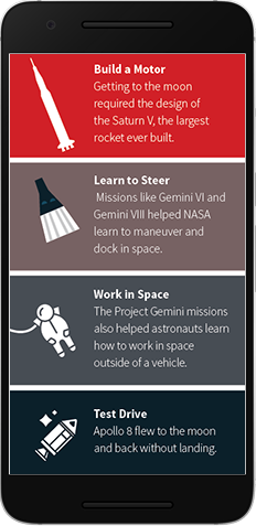
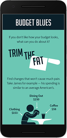
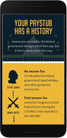
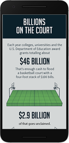
The original lesson designs. Focus group testing refined the look of the graphics, but the core concepts remain. This set demonstrates the use of metaphor and history to connect learners to abstract ideas. Art direction by myself. Graphic design by Ginger Dee.
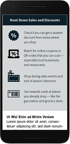
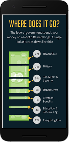
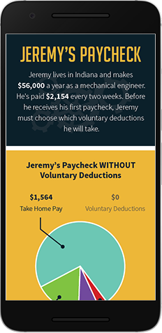
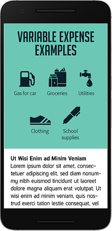

Infographics were used to illustrate scenarios and connect concepts to the real world. Icons helped break up long passages of text. Art direction by myself. Graphic design by Ginger Dee
Setting Direction for Video
Initially, Student Connections hoped to incorporate student generated content into "WhichWay?" Unfortunately, the project's timeline didn't allow for this.
I proposed an alternative: Create a series of Q&A videos with students. This took advantage of Student Connections relationships with local colleges and universities. It also achieved the original goal of including authentic student perspectives, and allowed us to hit the necessary deadlines.
I was instrumental throughout the video development process; organizing interview questions, assisting in location scouting, planning set design, and supervising multiple shoots. Once the interviews were complete,
I dug through the raw video and crafted it into a script the video developers could work from, and provided art direction for the videos.
Editing and Script Supervision
Once the larger problems were solved, my role became more focused. Before lesson drafts were written, I worked with the content team's subject matter expert to identify ways graphics could best support (or stand in for) written text. As the team's instructional designers finished a lesson draft, I would edit it and refine the graphic concepts.
My goal was always to make the lesson text as short as possible while maintaining clarity. This eventually affected the writing style of the instructional designers and copy tightened up. I also worked with the app's graphic designers to ensure that the final lesson scripts were interpreted correctly. This evolved into a formal review of the graphics before they moved into the development phase.
I continued in this role until product development ended.
